
Box and Whisker Plot Maker
Plot Labels
Plot Options
Data Input & Management
Group 1
Group 2
Group 3
Generate Plot
Download Options
Analysis Results
Detailed Results
Generate a plot to see detailed statistical results.
Statistical Interpretation Your Result
Interpretation
Generate a plot to see interpretation of your box plot.
Download Your Analysis Report
Generate a comprehensive PDF report with the box plot, detailed results, and interpretation.
Did you know that good data pictures can make complex data easier to understand by up to 90%? A key tool for this is a bar plot with error bars. It is a significant aid in statistical analysis and data visualization.
Creating a bar plot with error bars can be challenging. However, our graphing tool makes it easy. It allows users to create clear, high-quality images of their data.
With our generator, you can spend more time understanding your data. You will not get stuck on how to create the graph. This makes the data easier to see and helps with the statistical analysis.
How to use the tool effectively
Data Input:
- Use the sample datasets (Normal Distribution, Group Comparison, etc.) to quickly test the tool
- Or enter your own data in the text areas – use comma-separated numerical values
- Each group needs a name and dataset
Basic Workflow:
- Enter or load sample data
- Customize labels and appearance
- Click “Generate Bar Plot”
- Download in your preferred format
Key Features
Plot Customization:
- Labels: Set plot title, axis labels with customizable colors and sizes
- Orientation: Choose vertical or horizontal bars
- Error Bar Types: Standard deviation, standard error, 95%/99% confidence intervals, or custom multipliers
- Bar Styles: Filled, outline-only, or gradient fills
Visual Options:
- Individual group colors (click the color picker for each group)
- Background color customization
- Grid lines toggle
- Adjustable bar width and error bar cap size
- Multiple text formatting options
Data Management:
- Add/remove groups dynamically
- Generate random test data
- Clear all data option
- Built-in statistics calculation and display
Export Options:
- Multiple formats: PNG, JPEG, WebP, PDF, SVG
- Quality settings (1x to 4x resolution)
- Standard or custom canvas sizes
- High-resolution output for publications
Tips for Best Results
- For scientific publications, use 95% confidence intervals with higher resolution (3x-4x)
- The tool automatically calculates appropriate y-axis scaling based on your data and error bars
- Use the statistics panel to verify your calculations
- For presentations, the gradient bar style can be visually appealing
- The tool handles both small and large datasets effectively
Key Takeaways
- Good data pictures help us better understand complex data.
- Bar plots with error bars are key for statistics.
- Our tool facilitates the creation of bar plots with error bars for each group.
- This makes the data clearer.
- This helps to obtain more accurate statistics.
What Are Bar Plots with Error Bars
The error bars on the bar plots indicate data uncertainty. They are key to scientific research. They help to share data reliability.
The Anatomy of a Bar Plot
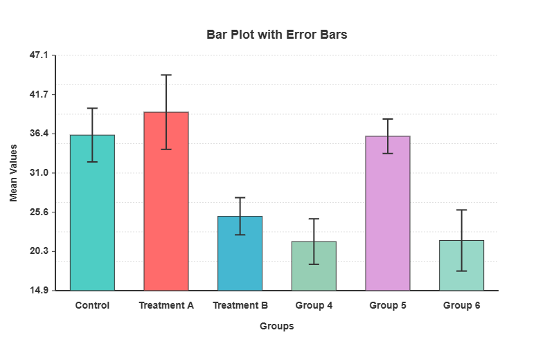
The bar plot has bars for different groups. The size of each bar represents a value. It has labels, a title, and sometimes more legends or grid lines.
Understanding Error Bars and Their Purpose
Error bars indicate data variability or uncertainty. They can be standard deviations, standard errors, or confidence intervals. Knowing the type of error bar is key to understanding the data.
| Error Bar Type | Description |
|---|---|
| Standard Deviation | Shows data variability. |
| Standard Error | Shows the sample mean variability. |
| Confidence Interval | Gives a range of the true mean. |
When to Use Error Bars in Data Visualization
Error bars are useful for comparing groups. They show whether the differences are real. In science, they show measurement precision and reliability.
Error bars in bar plots make the data clearer. This helps in understanding and making better decisions.
Types of Error Bars for Statistical Visualization
The error bars indicate the certainty of the data. They help us better understand the data. This is key to clearly showing the data.
There are several types of error bars. Each is used for different reasons. The right one depends on what you want to show.
Standard Deviation Error Bars
The standard deviation error bars show the data spread. They inform us about the variability of the data.
Standard Error of the Mean
The standard error of the mean (SEM) shows how precise the mean is. It indicates the extent to which the mean might change.
Confidence Intervals (95%, 99%)
Confidence intervals provide a range for the true mean. The significance level was set at 95% or 99%. They help us to test hypotheses.
Custom Error Values and Asymmetric Error Bars
Occasionally, custom error values are required for this purpose. This is true for special data or experiments. Asymmetric error bars indicate different upper and lower bounds. They provide a detailed overview of uncertainty.
Choosing the appropriate error bar is important. This helps us to better see and understand the data.
Getting Started with Our Bar Plot with Error Bars Generator
I am excited to help you get started with our bar plot generator. It is easy to use and allows immediate creation of bar plots with error bars.
System Requirements and Compatibility
Ensure that your system meets the basic requirements before using our generator. It can be used on any modern browser on a computer. Chrome, Firefox, and Safari work best.
You do not need to download or install anything. This makes it easy to start creating bar plots.
Accessing the Online Generator Tool
To use our bar plot with error bars generator, simply visit our website. Click on the link to the generator tool. You do not need to sign up to start, but it helps if you do.
Interface Overview and Key Features
When you reach the generator, you will see a simple interface. It has fields for data, options for error bars, and methods to change colors and labels.
Our online generator is user-friendly. Knowing the system requirements and tool features helps create great visualizations.
Preparing Your Data for Effective Error Bar Visualization
Preparing your data is key to obtaining good error bar plots. You must follow certain steps. This ensures that your plots are clear and useful.
Required Data Format and Structure
Your data should be in a neat order, such as in columns or rows. This depends on the tool used. Separate spots are required for data and errors.
For example, if you are measuring plant heights, one column for heights and another for errors is good.
Calculating Error Values from Raw Data
First, determine the type of error required. Standard deviation, standard error, or confidence intervals may be used.
- The standard deviation shows how spread out the data are.
- The standard error indicates the extent to which the sample mean may differ from the true mean.
- Confidence intervals provide a range in which the true value might be.
Importing Data from Excel, CSV, and Databases
Most tools allow data to be imported from Excel, CSV, or databases. Ensure that your data is clean and correct before importing it.
| Data Source | Import Method | Notes |
|---|---|---|
| Excel | Direct import or copy-paste | Ensure data is in a structured format |
| CSV | File import | Check for delimiter consistency |
| Databases | SQL queries or direct connection | Requires database access permissions |
Data Cleaning Considerations
Cleaning data is very important. This involves correcting errors, addressing missing information, and ensuring consistency. This step is key to avoiding mistakes in your plots.
By following these tips, you can prepare your data for great error bar plots. This makes the plots more accurate and useful.
Step-by-Step Guide to Creating Your First Bar Plot with Error Bars
To create a bar plot with error bars, follow these simple steps. Our online generator can assist you. You will learn how to enter your data and check your plot.
Entering Your Data Values and Error Measurements
Start by entering your data and error values. You can type it in or upload it from an Excel or CSV file. Ensure that each piece of data has an error value.
Selecting the Appropriate Error Bar Type
Next, select the appropriate error bar type. You can choose from the standard deviation, standard error, or confidence intervals. Choose based on your data and what you want to show.
Generating the Basic Plot
After selecting the error bar type, make the plot. Our tool creates a bar plot with error bars. You can then change the colors, thickness, and more to your liking.
Initial Preview and Assessment
Now, look at the plot. Check if it shows your data well. Check if the error bars are correct and if the plot is easy to understand. Make changes if needed.
By following these steps, a bar plot with error bars can be created. This will demonstrate the importance of your data and how it varies.
Customizing the Visual Elements of Your Bar Plot
Customizing your bar plot is the key to making your data pop. Our tool allows you to choose from several options. This makes the plot clear and pretty.
Color Schemes and Bar Patterns
Choosing the appropriate colors and patterns is important. Our tool has many ready-to-use color schemes ready to go. You can also select unique colors for each bar. In addition, different patterns help to display your data in fun ways.
- Choose from pre-designed color schemes
- Customize individual bar colors
- Apply various bar patterns for differentiation
Adjusting Bar Width, Spacing, and Orientation
Changing the bar width, spacing, and orientation will improve your plot. You can adjust these to fit your data and needs. For example, wider bars highlight important points. Changing the orientation can improve the plot for certain data.
- Adjust bar width for emphasis
- Modify spacing for better readability
- Change orientation for different data types
Modifying Error Bar Thickness and Cap Width
The error bars show the confidence in the data. You can change their thickness and cap width. This makes them clearer and more pleasant to look at.
Adding Grid Lines and Background Elements
Gridlines and background elements make your plot clearer. Our tool allows you to add grid lines and change the background. These features help make your plot more understandable.
- Add grid lines for better data alignment
- Change background color to suit your presentation
- Include background elements for additional context
Using these options, a bar plot that shows the data well can be created. It will also grab the audience’s attention.
Creating Professional Bar Plot with Error Bars in Different Software
Many software options can help create professional bar plots with error bars. We will examine Origin, Excel, R programming with ggplot2, and Python with Matplotlib and Seaborn. Each has unique features and abilities.
Using Origin for Advanced Bar Plots with Error Bars
Origin is excellent for creating advanced bar plots with error bars. It is easy to use and has many options. You can import data, calculate errors, and create excellent plots. The key features include customizable error bars, advanced tools, and export options.
Excel Techniques for Error Bar Visualization
Excel is a common tool for creating bar plots with error bars. Although not as powerful as some, it is easy to use. Tips for using Excel include using the error bar feature, customizing styles, and formatting the charts.
R Programming Approaches with ggplot2
ggplot2 is excellent for R users who want high-quality plots. It is flexible and powerful for customizing plots. The key benefits include the ability to create complex, high-quality plots and combine analysis and visualization.
Python Solutions with Matplotlib and Seaborn
Python’s Matplotlib and Seaborn are suitable for bar plots with error bars. Matplotlib offers several visualization options. Seaborn creates attractive and informative graphics. Tips for using Python include using the flexibility of Matplotlib and the high-level functions of Seaborn.
Choosing the right software helps create professional bar plots with error bars. These plots clearly show the data insights.
Adding Context with Labels and Annotations
In data visualization, context is important. Labels and annotations are extremely helpful. They ensure that we understand the data in bar plots with error bars.
Creating Effective Titles and Axis Labels
A good title and clear axis labels are key elements. The title should indicate what the plot is about. The axis labels should indicate what the data mean and their units.
Adding Data Labels and Values
Data labels make the bar plots easier to read. The exact values are shown on the bars. This is beneficial when the exact values are important.
Including Clear Legends
A clear legend is vital when a bar plot has many categories. This helps us distinguish between different bars and what they mean.
Annotating Specific Data Points and Trends
Annotations can indicate important data points or trends. They use text or arrows to draw attention. This helps us to see the main points.
The following are some tips for better labeling and annotation:
- Use simple and clear language in titles and labels.
- Ensure that the legends are easy to read and clear.
- Highlight data points that are special or require further explanation.
Advanced Bar Plot with Error Bars Techniques
To improve your bar plots, try using advanced techniques. These methods help to present complex data clearly. The plots will be more interesting and useful.
Creating Grouped Bar Plots with Error Bars
Grouped bar plots are useful for comparing many categories. Adding error bars makes the variability of the data clear. Here’s how to do it:
- Sort the data into categories and groups.
- The mean and error for each category in each group were determined.
- Tools such as Origin or Python’s Matplotlib can be used for plotting.
Designing Stacked Bar Plots with Error Bars
Stacked bar plots show complex data. They allow you to see the total value and how each part adds up. When adding error bars, consider how to show them for the stacked parts.
Key considerations:
- Ensure that the error values are correct for the stacked bars.
- Choose a tool that can handle these plots.
- Use clear labels and legends.
Implementing Color Gradients for Data Intensity
Color gradients can indicate data intensity or other continuous variables. They add more information to your plots. Here is how to use them effectively:
- Choose a color palette that is easy to understand.
- Ensure that the gradient scales are correct with the data.
- Use legends to explain colors.
Using Custom Templates for Consistent Reporting
Custom templates help make reports look similar. They save time and maintain a consistent appearance. Design a template for your bar plots with error bars.
The benefits of custom templates include:
- Consistent style of visuals.
- Quick creation of new plots is possible.
- Easy updates with new data are possible.
Statistical Considerations and Interpretation
To share data insights effectively, we must understand the error bars in bar plots. Knowing these statistics is key for the right data use and smart choices.
Choosing the Right Error Bar Type for Your Analysis
Choosing the appropriate error bar type is key to sharing the correct statistics. You can choose from the standard deviation, standard error, and confidence intervals. For example, the standard deviation error bars show the data spread. However, the standard error bars show better mean precision.
Interpreting Overlapping Error Bars
The overlap of error bars can be tricky. However, this does not always imply a lack of difference. The size of the overlap and error bar type is important. For standard error bars, a small overlap indicates a large difference, and a large overlap indicates none.
Statistical Significance and Error Bar Visualization
Error bars indicate data reliability and group differences. However, they do not tell the whole story. More tests are needed to ensure data significance.
Common Statistical Misinterpretations to Avoid
There are traps to avoid when looking at the error bars. Do not assume that non-overlapping bars always indicate a difference. In addition, error bar types should not be confused. Knowing these helps to share data correctly.
Exporting and Sharing Your Visualizations
After creating a bar plot, you will want to share it. It is important to share this information in the best way. This is key to showing your findings to others, such as in a paper or online.
Available File Formats
Our bar plot generator allows you to save in PNG, SVG, PDF, and EPS formats. Each is suitable for different purposes. PNG is great for the web, whereas PDF and EPS are best for printing.
Resolution and Size Considerations
Consider the resolution and size when saving your plots. For prints, a high resolution (300 DPI) was used. For the web, a lower resolution is acceptable, but ensure that it is not too large.
Embedding in Documents and Presentations
It is easy to include your bar plots in documents and presentations. Just add the image to your software, such as Microsoft Word or PowerPoint, and tweak it as needed.
Creating Interactive Versions
For online sharing, make your plots interactive. Use tools that allow people to hover for more information or change settings to see different views.
Real-World Applications of Error Bar Visualization
Error bar visualization is crucial in many fields. This makes the data clearer and easier to understand. This helps us understand the nature of certain data points.
Scientific Research and Experimental Results
In science, error bars show the range of data and how certain we are of it. They help compare results and determine whether the findings are real.
Business Performance and Financial Reporting
Businesses use error bars for financial data, such as sales or market trends. This shows the possible range of results. This helps make smart choices.
Educational Assessment and Academic Research
In schools, error bars show how students perform or how teaching methods work. This helps determine whether the teaching methods are effective.
Data Journalism and Public Information
Data journalists use error bars to share accurate statistics with the public. This makes data stories clear and trustworthy. This helps people determine whether the information is reliable.
Using error bars, experts in these areas can clarify their data. This helps everyone make better choices and understand the data better.
Troubleshooting Common Issues with Error Bar Plots
Working with data visualization tools can be challenging. Bar plots with error bars are not an exception. We will examine common problems and their solutions.
Fixing Data Import and Format Problems
One major issue is data import and format. Ensure that your data fit the tool you are using. Check for the correct format and no missing or extra values.
| Issue | Solution |
|---|---|
| Incorrect data format | Check data format compatibility |
| Missing values | Fill or remove missing values |
| Duplicate values | Remove duplicate entries |
Resolving Visual Rendering Issues
The plots may not appear correct at times. This could be due to incorrect axis settings or excessive overlap. Please try changing the plot settings or using different options.
Addressing Error Calculation Concerns
Error calculation is key for bar plots with error bars. Ensure that the error values are correct. Please check your methods and make changes if needed.
Solving Export and Compatibility Difficulties
Exporting your plot can be difficult. Please refer to the supported file formats. Adjust the size or resolution for the best results.
Knowing how to solve these problems helps create great bar plots. They will clearly and effectively show your data.
Comparing Visualization Tools for Error Bar Creation
There are many tools available for creating error bars. Each tool has its own benefits in creating these visualizations. Therefore, selecting the appropriate one is crucial.
Web-Based Generators vs. Desktop Software
Web-based generators are easy to use and require no installation. Visualizations can be made directly in the browser. No installation is required.
Desktop software, on the other hand, has more features. This is great for complex tasks because it can be used offline.
Free Tools vs. Commercial Solutions
Free tools are perfect for those who are watching their budget. They perform well for simple tasks. However, they may not have all the features you require.
However, commercial solutions have more advanced features. They also provide better support. They are best for serious work or business needs.
Programming Approaches vs. GUI-Based Tools
Programming tools such as Python or R provide a lot of control. You can create visualizations exactly as you want them. However, it is necessary to know how to code.
GUI-based tools are easier to use than CLI-based tools. They have a simple interface. This makes them ideal for individuals who lack coding knowledge.
Choosing the Right Tool for Your Needs
Consider your needs before selecting a tool. Consider the complexity of your data and the extent of customization you desire. Additionally, consider your budget.
By examining these aspects, one can identify the best tool for creating error bar visualizations.
Best Practices for Effective Data Communication
Good data communication is key to clearly sharing insights. When I create bar plots with error bars, I follow important steps. These steps helped make my visualizations clear and interesting.
Design Principles for Clear Visual Communication
I keep my designs simple and clear. I select colors that are easy to see and do not clutter the plot. In this way, my plots tell the story I want to share.
Color Selection and Accessibility Considerations
I consider color blindness when selecting colors. I ensure that the colors I choose are easy for everyone to see. This makes my plots more accessible to a wider audience.
Avoiding Common Visualization Pitfalls
I steer clear of mistakes, such as wrong scales and too many error bars. These mistakes can confuse people and change the message I want to share with them.
Peer Review Checklist for Quality Assurance
Before I finish my plot, I receive feedback from others. They check if it is clear, right, and does its job well. This helps ensure that my plot is the best it can be.
Conclusion
Creating bar plots with error bars is key to clearly sharing data. Our tool helps create charts that are easy to understand. They present complex data in a simple manner.
Choosing the appropriate error bar type is important. You can also customize your charts. This makes it easier to observe trends and variability.
Use what you have learned to make your data stand out. Our tool allows you to create professional-looking charts. They are great for sharing online, in presentations, or in publications.
FAQ
What is a bar plot with error bars?
A bar plot with error bars shows the data with bars for the mean. Error bars are also included for data uncertainty.
Why are error bars important for data visualization?
The error bars indicate data uncertainty. They help viewers understand the reliability of the data.
What types of error bars are available in the generator tool?
The tool offers several error bar types. These include the standard deviation and standard error of the mean. It also has custom and asymmetric error bars.
How do I prepare my data for error-bar visualization?
First, ensure that your data are in the correct format. Then, the error values are calculated, if needed. You can import data from Excel, CSV or databases.
Can I customize the visual elements of my bar plot?
Yes, you can change many things in the model. This includes color, bar patterns, and width. You can also adjust the error bar thickness and add grid lines.
How do I choose the correct error bar type for my analysis?
Choose based on your research question and the data. The standard deviation, standard error, and confidence intervals were considered.
Can I export my bar plot with error bars in different file formats?
Yes, you can export in PNG, SVG, PDF, and EPS formats. You can also adjust the resolution and size for publication.
What are some common issues when creating bar plots with error bars, and how can I troubleshoot them?
The issues include data import and visual problems. In addition, there are issues with error calculation and export. Please refer to the troubleshooting section for assistance.
How do I ensure effective data communication using bar plots with error bars?
Follow the design principles for clear visuals. Choose colors wisely and avoid making common mistakes. A checklist was used for quality assurance.
What are some real-world applications of error-bar visualization?
It is used in science, business, education, and journalism. This shows data uncertainty and variability.
Can I create interactive versions of my bar plot with error bars for online sharing?
Yes, interactive versions can be created. This allows viewers to explore the data in more detail.